2019
K Health
Design system and illustrations
During my first few weeks at K, I created a design system that included components, rules, and a style guide for the app. The team I worked with included another designer and 5 engineers. Later on, we partnered with an illustrator and recreated the app's illustrations and graphic language. We also had a ux researcher on the team, that helped us in user testing along the way, to ensure we're heading in the right direction.

K Health started as a POC, a simple app that had one main flow.
As the company and the product grew, the need of forming a design system became more pressing: the app had many inconsistencies. We had lots of different typography styles, buttons, and colors. Each of these elements was manually created by one of the designers every time they needed to use one.
And as a result - the code was a mess, too. Every time a developer needed to create a new page, they were basically starting from scratch, and each element was hard-coded.
The main goals of the project were:
Efficiency
Make sure the code is well organized, clear to all, and easy to use.
We established a mutual dictionary, which helps us communicate with engineers more easily.
Consistency
Make sure all elements are the same, all pages look like they're a part of the same product, and the user experience is consistent. Also, since our team is working from 2 locations with different time zone, we had to make sure that there's one source of truth to count on so that eventually the end-user would not be able to tell the pages were not built by the same designer.
Better experience
We took this project as an opportunity to introduce some UI and UX changes that we felt were needed - changing some of the fonts, saying goodbye to some of the colors, updating the way the chat worked, and adding animations and illustrations

Building the library
The first thing we did, is gathering and sorting all elements we could find (and we found a lot of them). Then, we marked the elements or functionalities that we need in the app. Then we created the basic element, and if needed - it's variants.
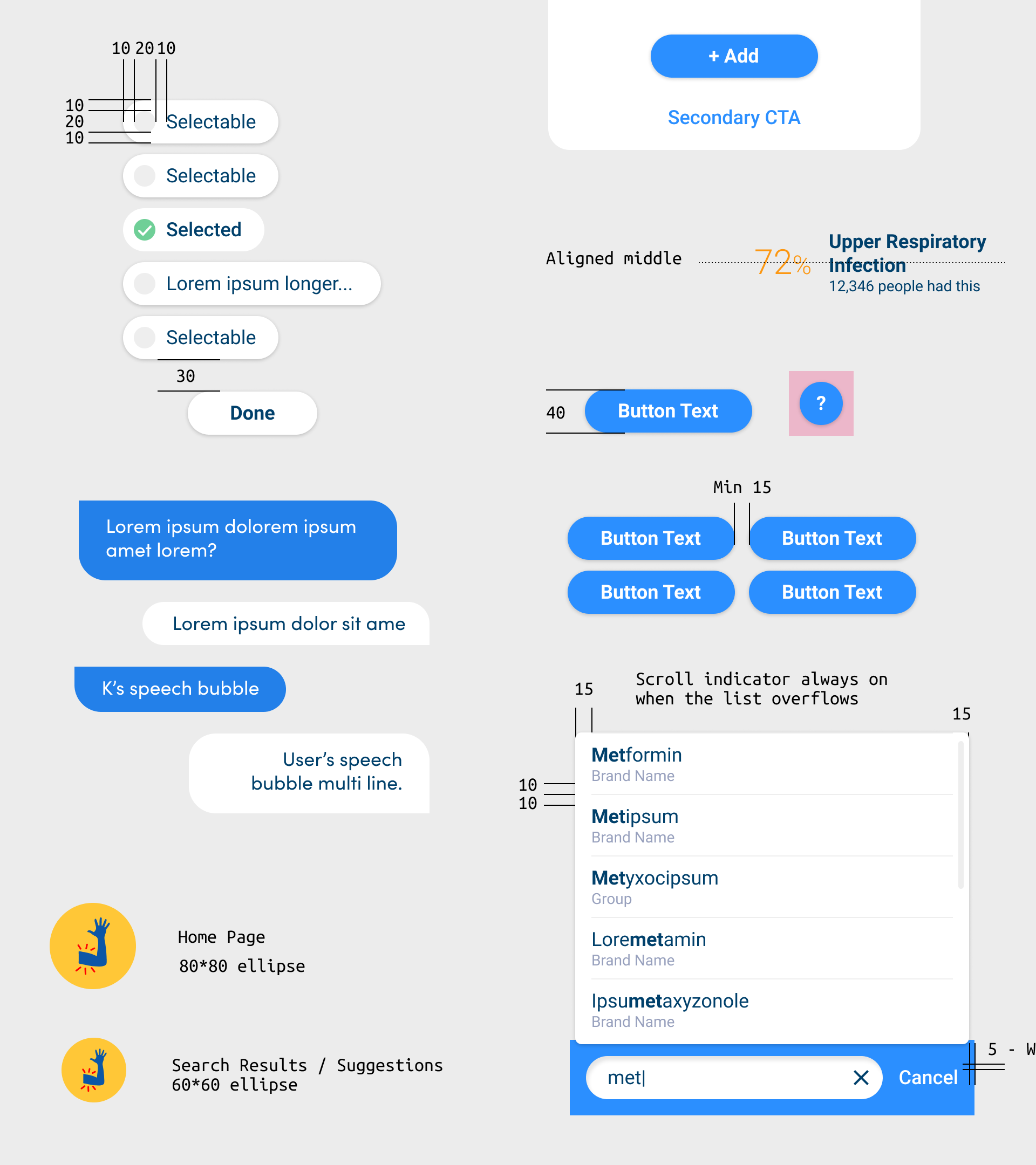
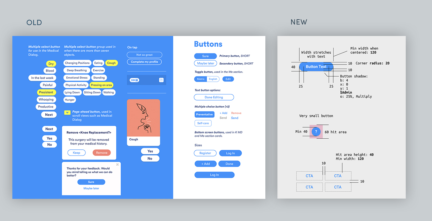
Here's an example. In the old versions, we had many kinds of buttons. We decided we actually just need two: A primary button, and a secondary icon (designed as a link). We also added an icon version, which is a variant of the primary button.

The next step was improvements to the chat, and other quick wins we felt could lift up the experience. Here are a few examples.
Better experience
Speech bubbles
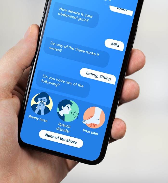
In the old UI, K would speak as white text over the screen's background, and the user answers were represented as buttons. In order to make it feel more like a chat and less like a questioner - we felt it would be better to use speech bubbles for both K and the user. We also chose a different font for that, to separate conversation elements from the system parts.
Fixed input ares
In the original version, answers to K's questions could be presented anywhere on the screen. Including, in some cases, answers that are hidden below or above the fold...
In the new UI, we decided the lower part of the screen would be dedicated to the user's input only. That way the user can always find the answers to K's questions. Also, the use of a fixed area for this task helps to create a uniform experience. The user doesn't need to waste time understanding the interface, and can focus on the content.
Animations and illustrations
Animations
We added two kinds of animations: in-app transitions, to help form a clearer experience, and Lottie animations, used as delighters.
Illustrations
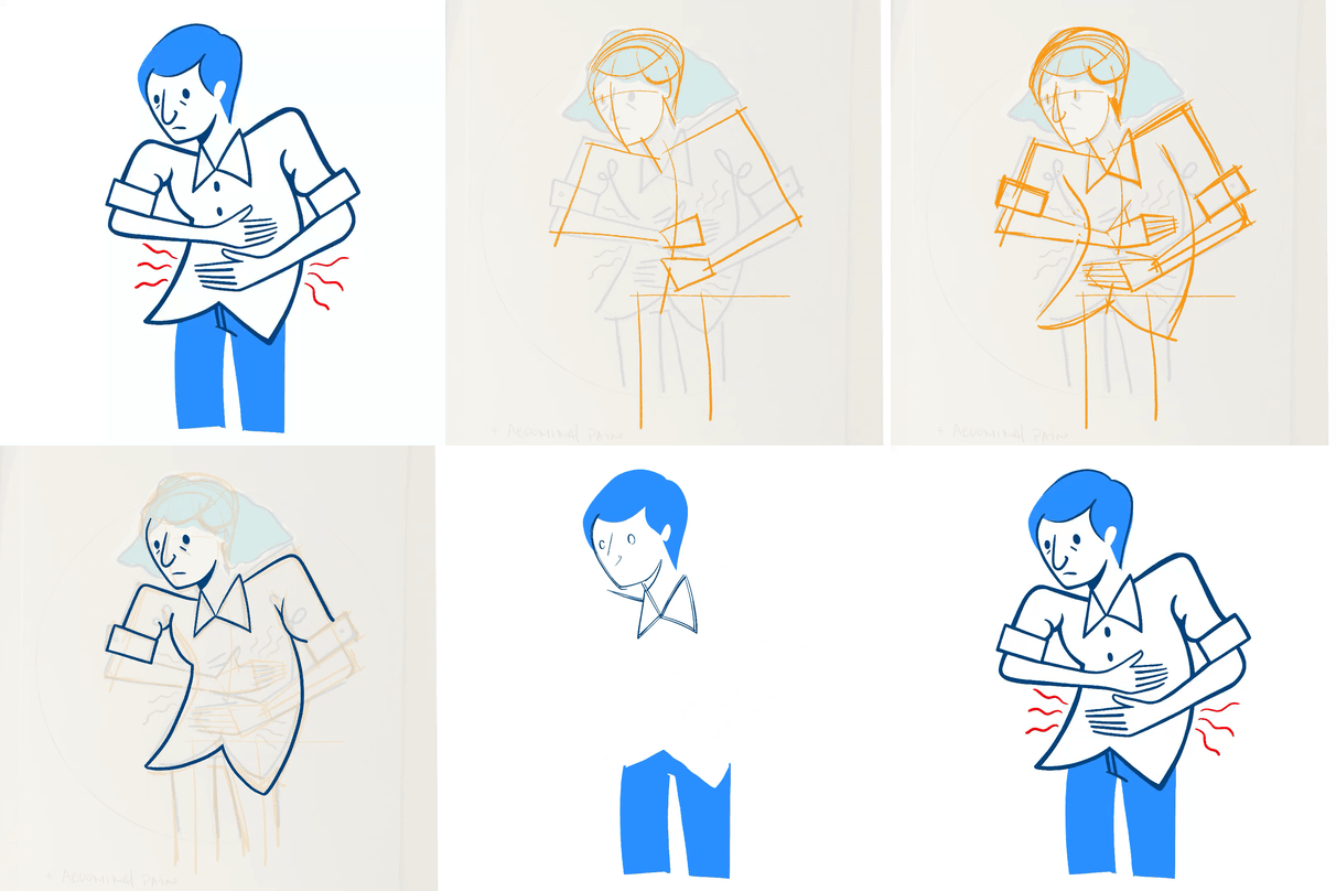
Finally - we wanted to replace the illustrations that the app had. We teamed up with Alf to recreate over 300 illustrations.
After a long process of exploration and user testing, we worked with our illustrator to create a system that could be flexible and adaptable to a wide range of uses.
We wanted the language to support K's voice and tone, and add empathy and uniqueness.
With a commitment to an inclusive and diverse representation, we created characters representative of users in the real world, depicting a wide range of facial features and body types.
Another important aspect is medical accuracy. For that, we consulted a primary care physician and pediatrician during the process and did user testing to make sure users understand what we wanted to say.
We found that for most of the users (87%) the new illustrations are medically accurate, and serve as a friendly and unintimidating visual aid.

Code and design library
After a few months of designers working back to back with developers - we have style guides and components that match the code library. The final result: the visual experience is now consistent across the company's different products: typography, icons, sizes, padding, and colors.


